Role
Graphic Designer
Brief
Create a brand identity for an activation by Harlem City Council
Deliverables
Exploratory research, infographics, typography layout
Design tools
Adobe InDesign, Illustrator and Photoshop


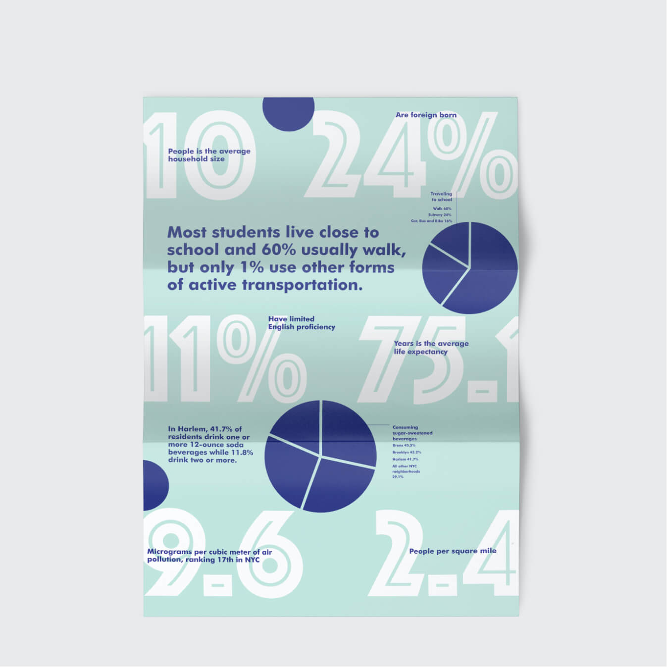
Harlem City Council wanted to launch a print campaign celebrating the rich diversity of their neighbourhood. Their starting point was an annual report that was very data heavy and needed to be brought to life and presented in an easily digestable way for their readers.
The challenge was to build a brand identity for this campaign, that would bring the brand to life in an engaging way.
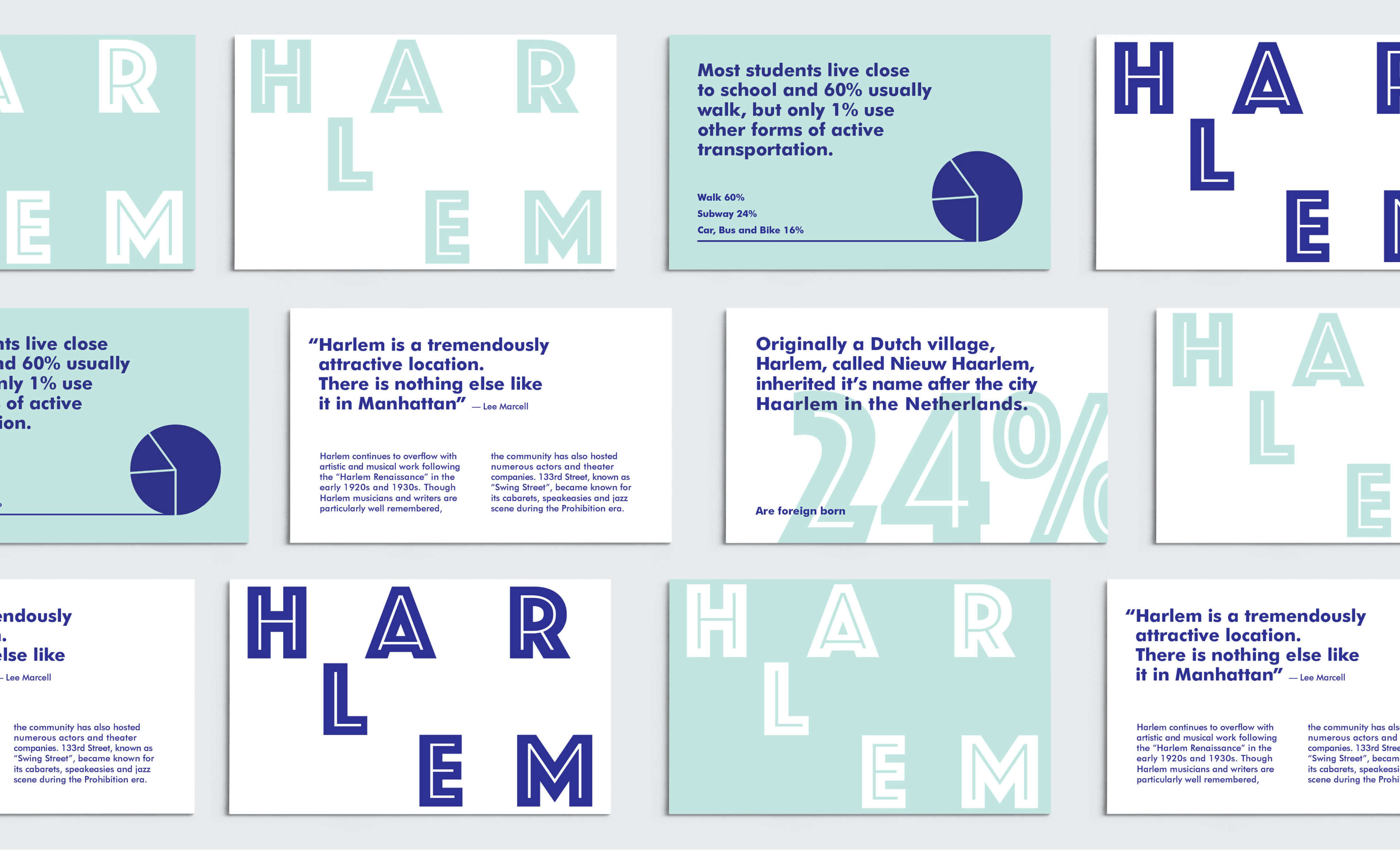
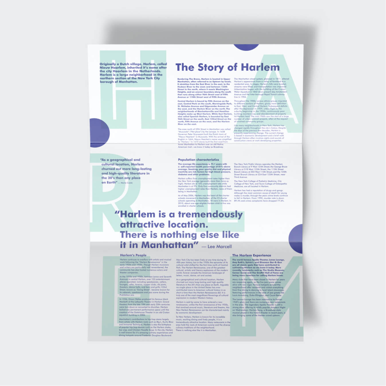
I began a process of exploratory research to try understand the problem and through that, define the needs of Harlem City Council. It was important that I fully understood what had worked and what hadn't in the past as I wanted to avoid echoing campaigns they had run previously. During the ideate process I made the design decision to avoid the use of photography where possible, and through that I was then able to make the content the hero and focused on the message with clever use of typography and a confident colour palette.

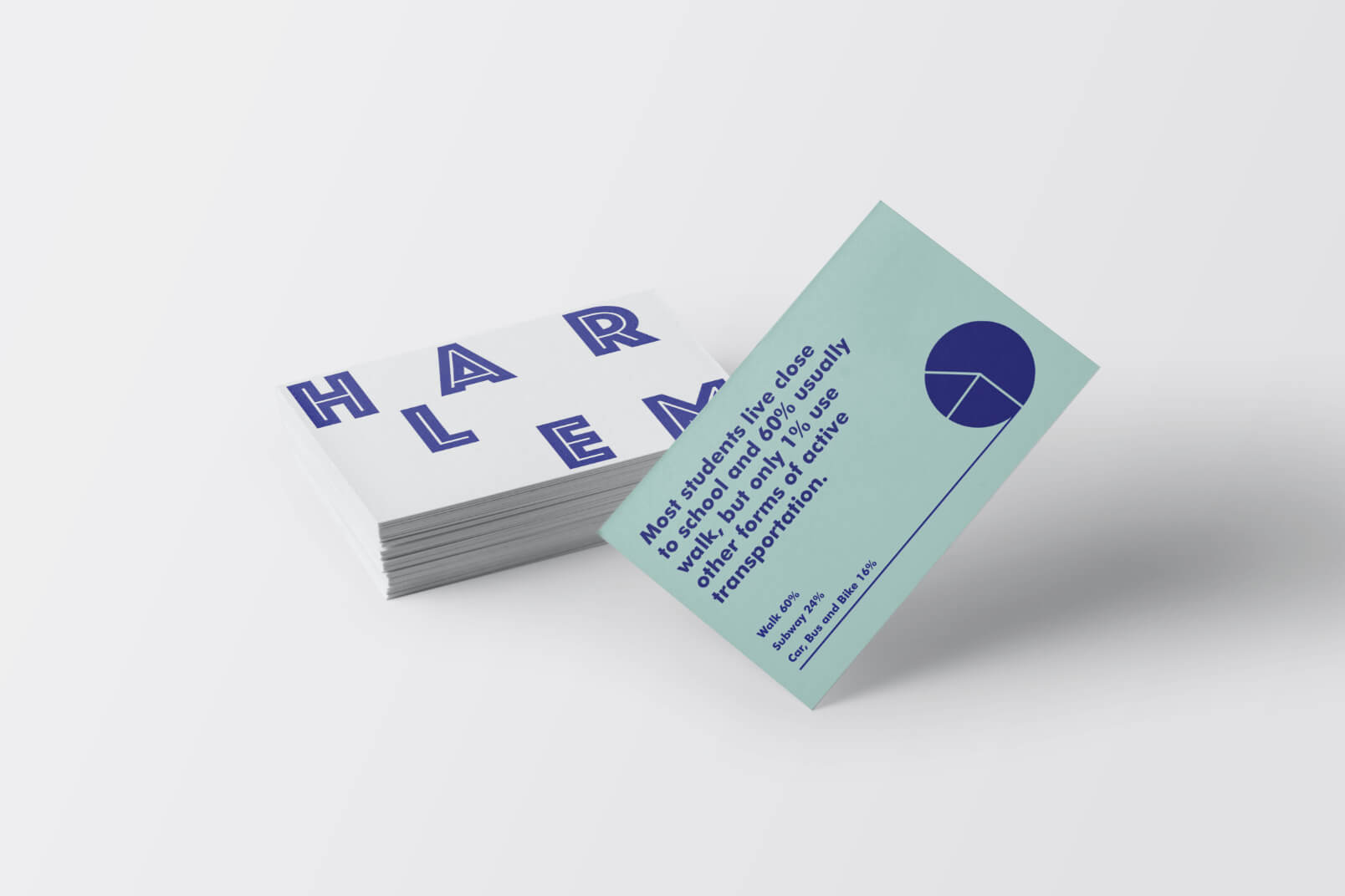
The completed design presented their annual report in a way that answered the needs of both Harlem City Council and the end user, by showcasing the information in a simple to understand and "snackable" way. The energy of the area was reflected in the typography by using a variation of size in content, and the bold colour choices spoke to the strong individuality of the residents.
This brief was a really enjoyable challenge that reiterated the value of type and encouraged me to explore ways to use it as a key design feature, rather than secondary to photography.