
Role
Experience Strategist, Interaction Designer, User Researcher, Information Architect, UX/UI Designer
Brief
Create a weather app for surfers, using creative solutions to show weather data in a simple and informative way.
Deliverables
Exploratory research, business requirement document, user interviews, personas, user journey’s, user flows, wireframes, mid-hi fidelity prototypes, usability test results, visual style guide & design language.
Design tools
Adobe XD, Adobe Illustrator, Axure RP, InVision, Marvel, Google Forms
Project challenges
SWELL was a solo project, which presented a set of challenges as I was responsible for the full scope without a team to support.
This challenge became a huge opportunity for me to develop skills in areas that I may not have been exposed to in a larger group.
I needed to balance the big picture of the experience of the user while also concentrating on the smaller details of the design, and this also led me to network and collaborate with other designers to ensure I was gathering feedback from all available avenues
Experience Strategy
Making surfing for everyone
What would make surfing more accessible?
Is it knowing where the best spots are?
More knowledge on how to surf?
Or could it be understanding how to pick the best time based on the weather?
I set out to understand surfers (aspiring and pro!), so I could create a product that helped make surfing a better and easier experience for them. Below is part of the journey, enjoy!
DESIGN THINKING
How I made waves in a digital space
The strategy for SWELL was created using the double diamond design model, which focuses on breaking up the design process into four stages; Discover, Define, Design, and Deliver.
Like any process, this journey was not linear, and all stages held many iterations. This encouraged constant validation of our design decisions, which ensured our solutions kept the needs of the user at the forefront.
Using the double diamond model, I approached the process with a clear plan for success.

Select a stage or scroll to view
discover
COMPETITOR ANALYSIS
Keeping an eye on the competitor
Learning what works and what doesn’t from what has already been done
My first step in my discover phase was to understand the market. I completed competitor analysis and market research, and dove into what was already in the hands of users.
I experienced first hand the highs and lows of what users were dealing with when wanting to head out for a surf.
This research was where I was able to uncover key insights around current trends in market leading surfing apps, which helped inform my design approach.
Do
 Provide real time data and weather graphs
Add value with local knowledge
Use a simple interface with clear call to actions
Provide real time data and weather graphs
Add value with local knowledge
Use a simple interface with clear call to actions
Don't
 Clutter the screen by showing multiple weather graphs at once
Drive crowds to quiet beaches by promoting them too much
Fill the screen with advertising space
Clutter the screen by showing multiple weather graphs at once
Drive crowds to quiet beaches by promoting them too much
Fill the screen with advertising space
USER INTERVIEWS
Exploring the problem
To find possible solutions, I must first determine what the user wants me to achieve
I needed to understand the problem from a users perspective, so I completed user surveys to get into their heads and started to build a picture of what they needed and wanted.
I gave users a voice and this is what they said

The perfect swell shouldn’t be guesswork
Our users told us that there’s nothing better than a surf in perfect conditions, however most users admit that attempting to read complex weather maps leave them frustrated and more likely to close an app and just “wing it”.
Users wanted simple. Graphs and charts that anyone could understand, clearly labeled with options for help if necessary.

Please, keep it together!
90% of users had to visit multiple sources to find all the data they needed before heading out for a surf. There wasn’t an app on the market that gave full weather charts in a clear and simple presentation that would cater for all skill levels.
Users wanted a one stop shop. They wanted to be able to view the weather, a surf cam, and wind/wave charts, while also having general information about the type of beach it is.

We have FOMO, all day every day
FOMO - The fear of missing out... Especially on the best waves. Users wanted to make sure they were in the best spot possible by comparing their current spot with spots nearby, to make sure they ended up with the best surf story on Monday at the office.
Users wanted visibility and control. They wanted to know they could make quick decisions on where to surf by having real time weather data in their hands.
Define
USER PERSONA’S
Building empathy with the target audience
I start to narrow the scope and define the needs and motivations of the target audience
In user interviews I used a divergent strategy to gain as much insight as possible about the potential users. I then used affinity mapping to identify themes of thought and behaviour between the diverse group.
From this I created two user persona’s. These were based on the two clear types of people that emerged from the user interviews.

Introducing Adam
38. Sydney, Australia
Adam lives by the beach and surfs every chance he can get.
He wants a simple platform that lets him compare the local beaches. He’s frustrated by needing to shop around for collecting key information such as weather, surf cams and wave reports.
Device
iPhone 11, Laptop
Work hard, play hard.
“My job is pretty demanding, so I live for the weekends. We head to the beach, and if there are waves - I want to be out there.“
Goals
• Compare weather at multiple spots
• View surf cam for frequently visited beach
• Be notified of upcoming weather trends
Frustrations
• Can’t find all the data he needs in one spot
• App’s cluttered with ad’s
• Can’t set alerts without paying for premium
Introducing Jess
28. Wellington, New Zealand
Jess loves to surf when she can - usually when she is on holiday.
She wants a platform that presents weather data in an easy to understand way. She’s frustrated by feeling like she doesn’t know what she’s doing just because she can’t read traditional wind and wave charts.

Device
iPhone SE, iPad
Love learning new skills
“I’m really grateful to live in such a beautiful spot, I want to learn to surf better so I can make the most of summer approaching”
Goals
• Check weather in holiday spots
• Review wind and wave charts
• Book lessons at a surf school
Frustrations
• Can’t find an app that shows surf data for
nearby beaches.
• Finds weather charts hard to interpret
• Has to Google search to find surf lessons
USER JOURNEY’S
When, where and why will they use SWELL?
Advocating for the user by understanding their journey
Armed with the information from the user persona’s, I started to develop user journey maps, which helped start shape how the app would be used.
In order to create a tool that will be used, we first need to understand when, where and why it will be used. This will help to shape the very first design decisions, such as mobile-first design, information architecture and navigation.
These user journeys also ensured I was developing an app that answered the users’ needs, goals and motivations. I continued to cycle through a loop of design, validate and iterate, until I had identified the pain points within these user journeys and had developed strategies to overcome them.
Adam’s journey
Adam is planning a weekend of surfing for him and a few friends.
He wants to find the best spots along a stretch of coast he is not familiar with by watching the weather maps for a week before they go.

USER FLOWS
Mapping out the specifics
Taking a journey and turning it into a flow
Keeping the user persona’s and user journey’s in mind, I started to draft three user flows that were simple, straightforward and involved minimal steps for Adam & Jess to reach their goals.

Design
LO, MID & HI-FIDELITY PROTOTYPES
Explore all of the possible solutions
Design, validate and iterate
I developed a Minimum Viable Product with paper prototyping, which meant I could iterate quickly and test the UX of a product without having spent too much time on development costs.
This journey between lo-fidelity to hi-fidelity gave me time to identify pain points along the user journey before moving to the next stage.

But... does it work?
During the develop phase, from MVP to hi-fidelity prototype, I took each stage through usability testing to validate what was being designed.
The usability tests were held as remote moderated tests, and I had set tasks for the users to accomplish. While the users interacted with the product, I took notes, observed pain points and rated satisfaction by getting the users to describe their experience after the test.
Below are some of the issues that users highlighted and how I approached solving them.
USABILITY TESTING & ITERATION
Pain points & how they were solved
Identifying weather icons
Problem
5/5 users tested took longer than 30 seconds to correctly identify what each weather icon represented.
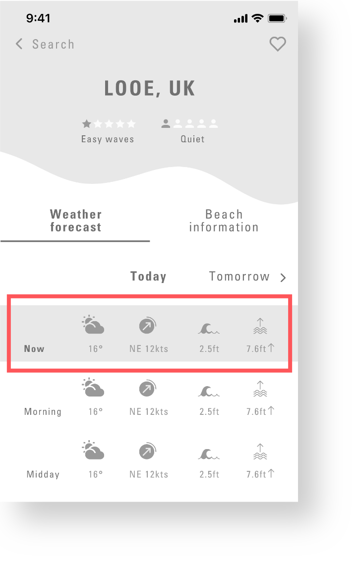
Solution
The names of the icons were added above the list in the forecast page, to assist learnability for the app.
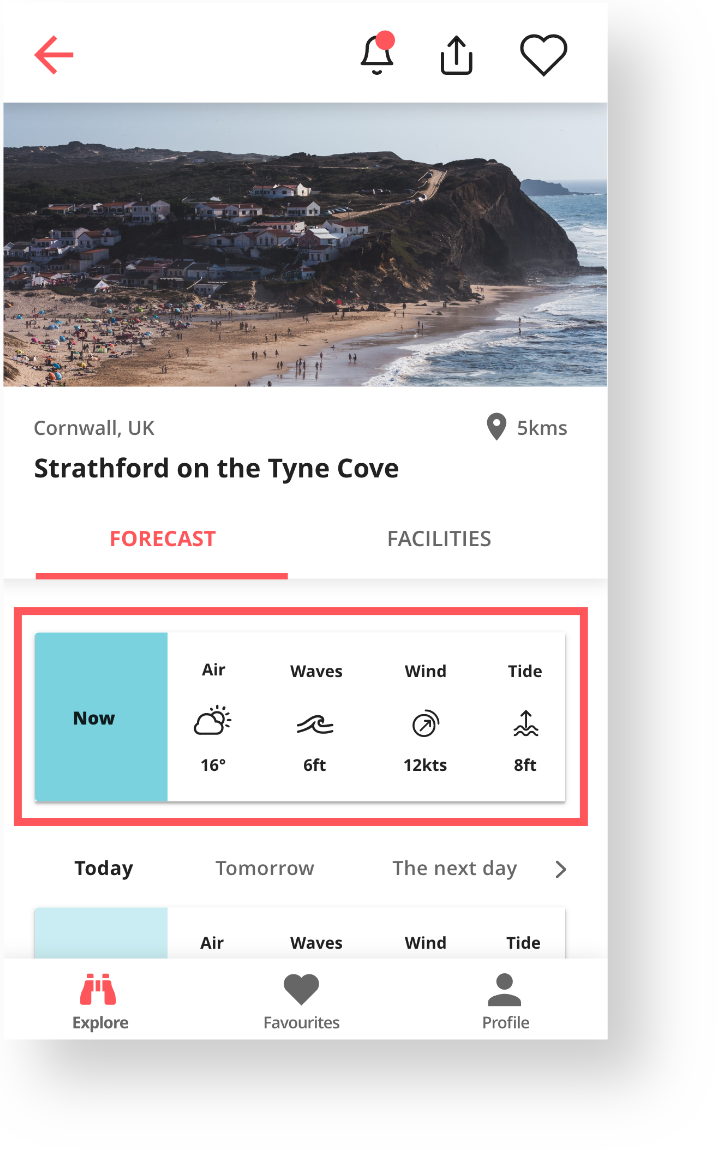
Low contrast on icons
Problem
3/5 users expressed concern about the white icons being on an image.
While the image did have a gradient applied, the users were unsure the icons had enough contrast.
Solution
The card design was changed to have the icons sit outside of the image area, ensuring that the icons will always be visable regardless of the background image.
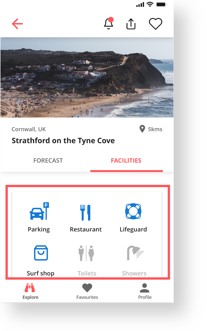
Facilities buttons
Problem
The use of buttons to display what facilities were available at a beach was confusing for the users, as they weren’t sure if they were interactive or not.
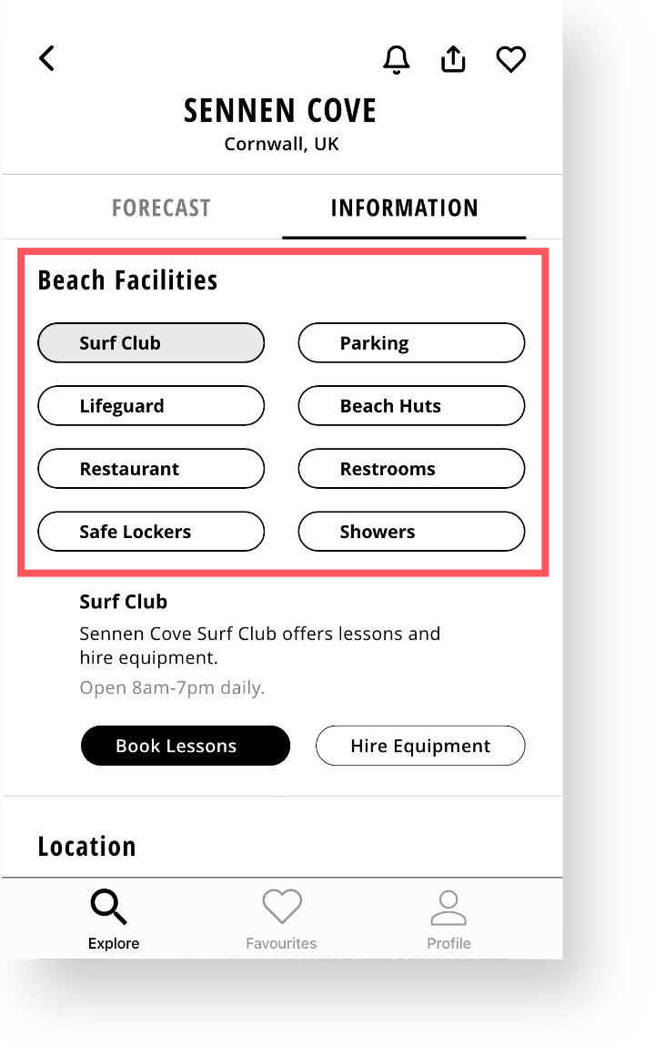
Solution
The buttons were changed to icons which provided a visual reference which made the content easier to see at a glance.
GRIDS & LAYOUTS
Creating a memorable first impression
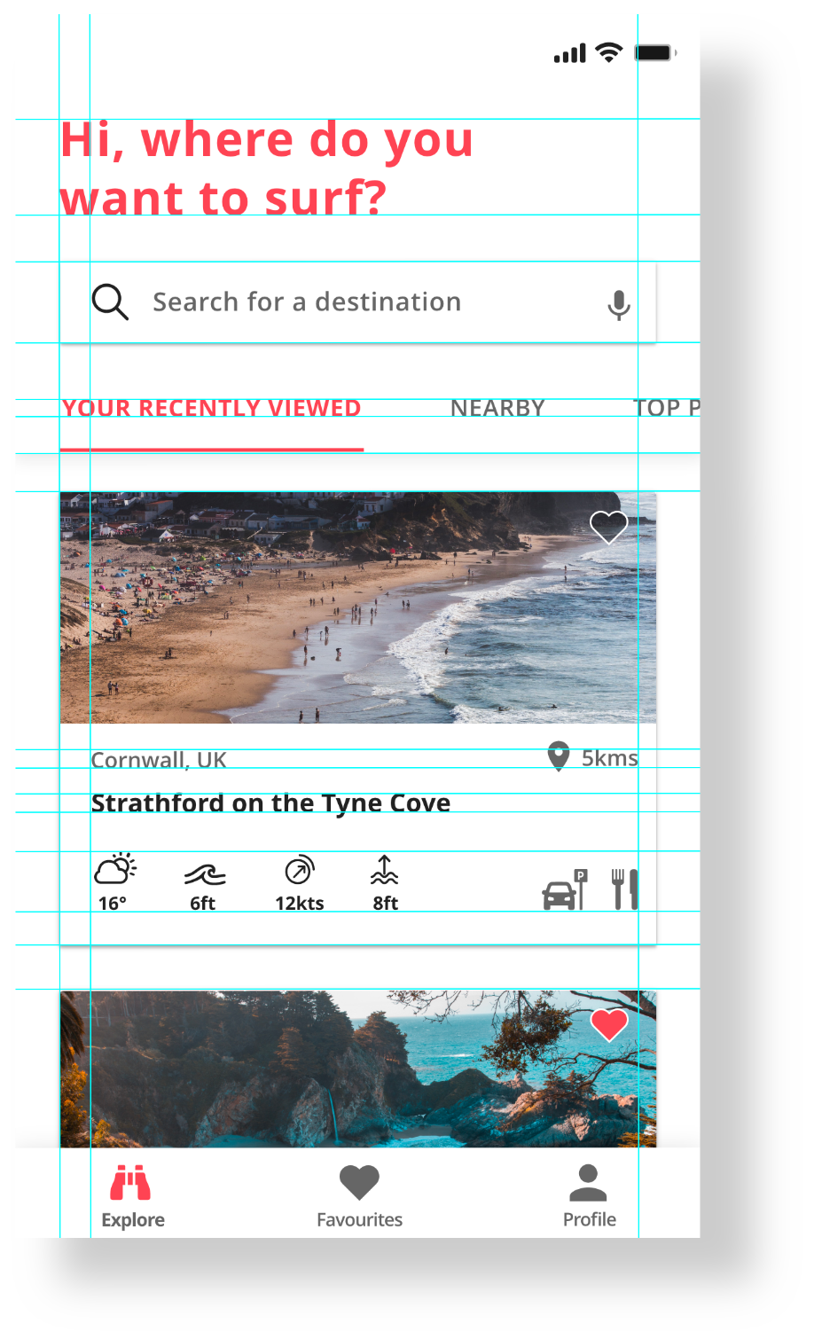
Using Gestalt laws, visual and emotional design, I then started to further develop the UI of SWELL. Initial ideas for SWELL saw early wireframes take a leap into colour, however users found it distracting and unnecessary.
The design was then reconsidered and redesigned with a clean white interface, and splashes of colour for the key information. Negative space became a pillar of the design language.
User satisfaction spiked from the colour change and my hypothesis that a simpler colour palette would lead to less cognitive load was validated.
An 8pt grid
The design was created to ensure all elments sat on an 8pt grid, which gave the design structure and a consistant baseline.
A four column layout
All screens used a 4 column layout, which gave options for the elements to have flexibilty within the grid, while giving visual harmony.
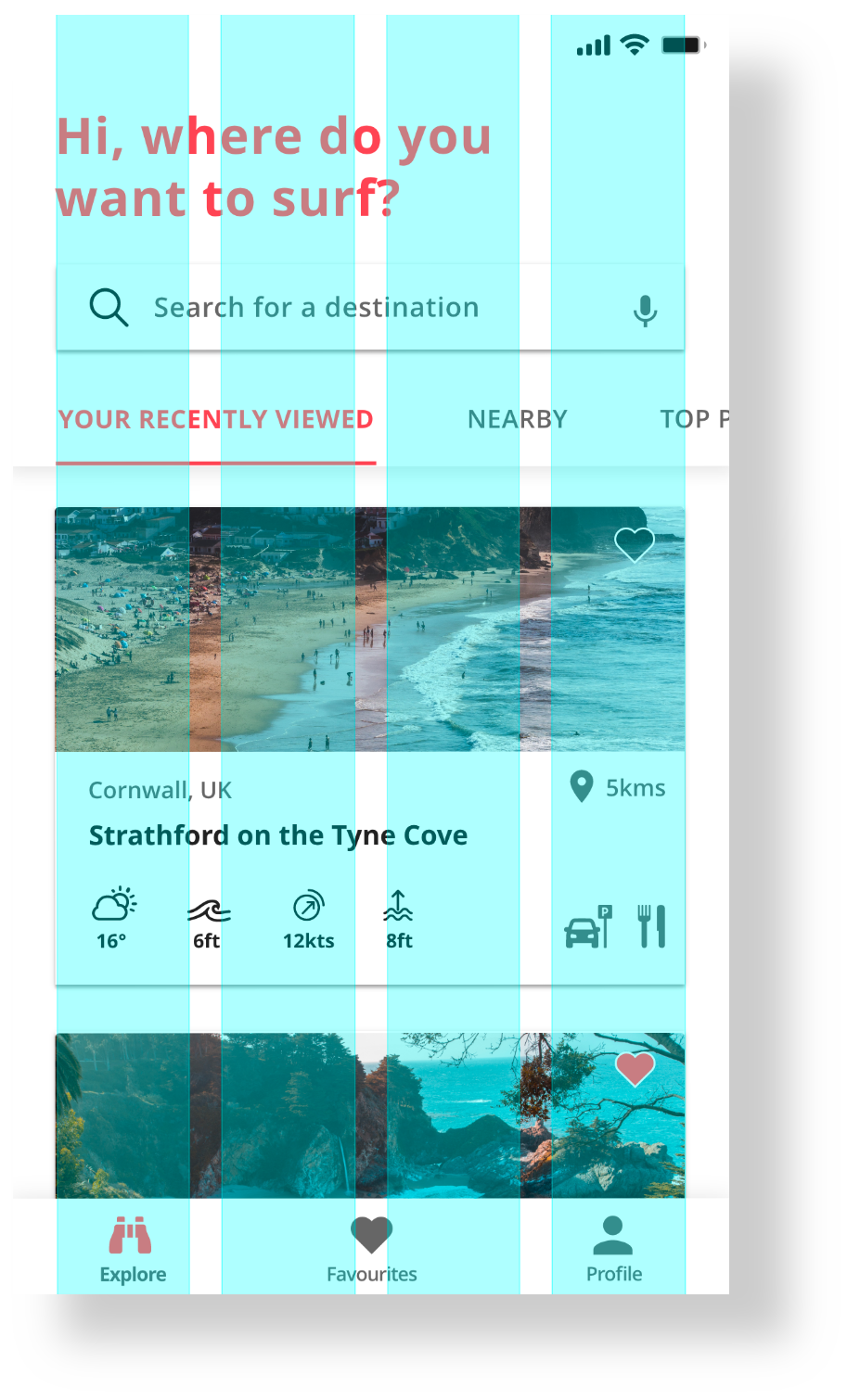
A final UI layout established
Using both the layout and grid system, the UI was clean, structured and simple to understand.
Deliver
DESIGN LANGUAGE
Defining the look, feel & voice
A design language was created to help communicate the language of SWELL to developers and to ensure consistency in future designs.
A bite size style guide for a quick look and feel was also created, as presented below.

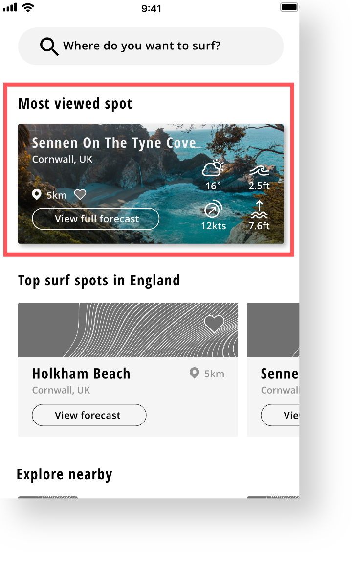
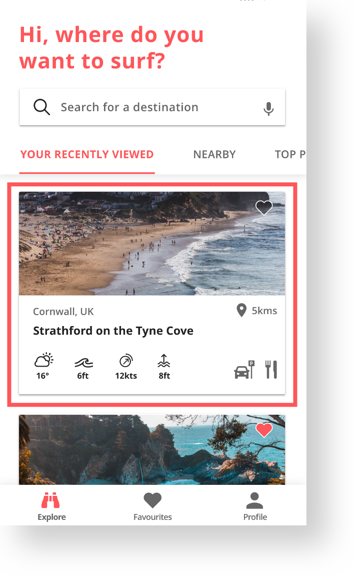
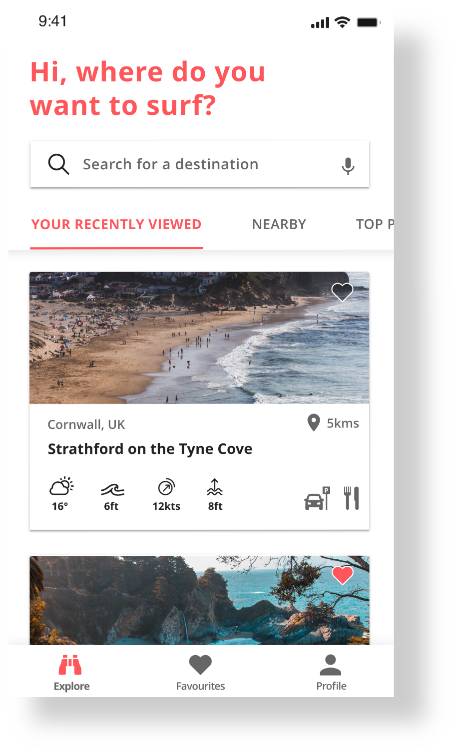
COMPLETED UI
Introducing, SWELL.
A weather app for surfers, that presents weather data in a simple and informative way.

Retrospective
Retrospective thoughts
As a graphic designer I had always been able to control every detail on a canvas, which taught me the discipline of producing pixel perfect designs.
However, as I learnt very quickly, designing digital products is vastly different. Each screen that a user will view my app on has variables. Then, the environment in which they use it has even more variables.
Will they be able to see the text if the contrast in colours can't compete with a sunny day?
I soon realised that in graphic design being able to control the size of a page, the colour contrast and the final printed design was a luxury.
So while I couldn't control every pixel - I could carefully consider how it would be viewed. I could design for multiple screen sizes, I could design for accessibility and above everything, I could design for the user.